2024
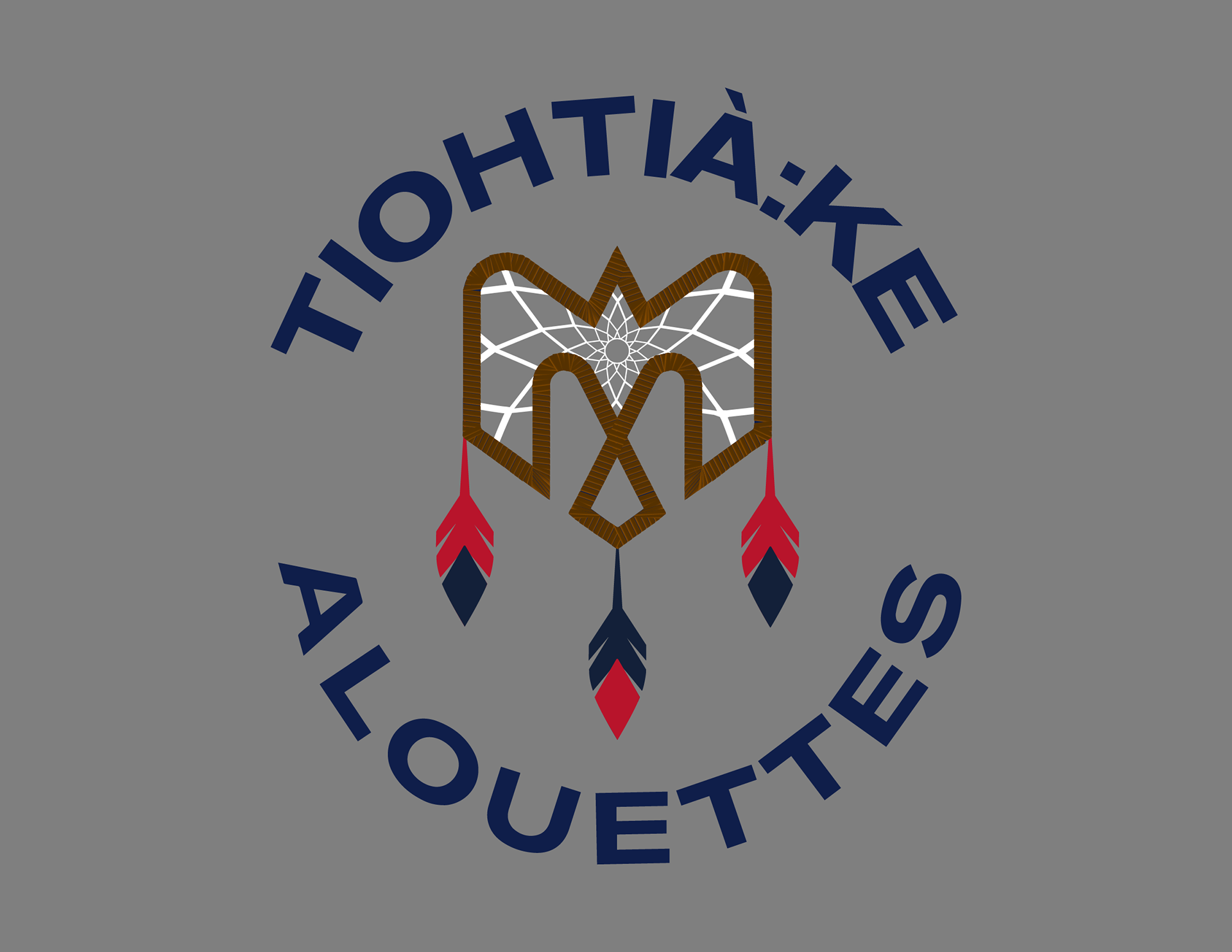
The Montreal Alouettes contacted the Kahnawà:ke Sports and Recreation Unit to ask local artists to participate in a competition to design an Alouettes logo for the Truth and Reconciliation weekend across the CFL.
The Original Winning Design

The Design the World Saw
Collaborating with the Director of Creative Services and Marketing Production for the Montreal Alouettes, we decided to unify the logo with the Alouettes' branding. These small changes brought the logo to life, and it has taken off from there.
RATIONALE
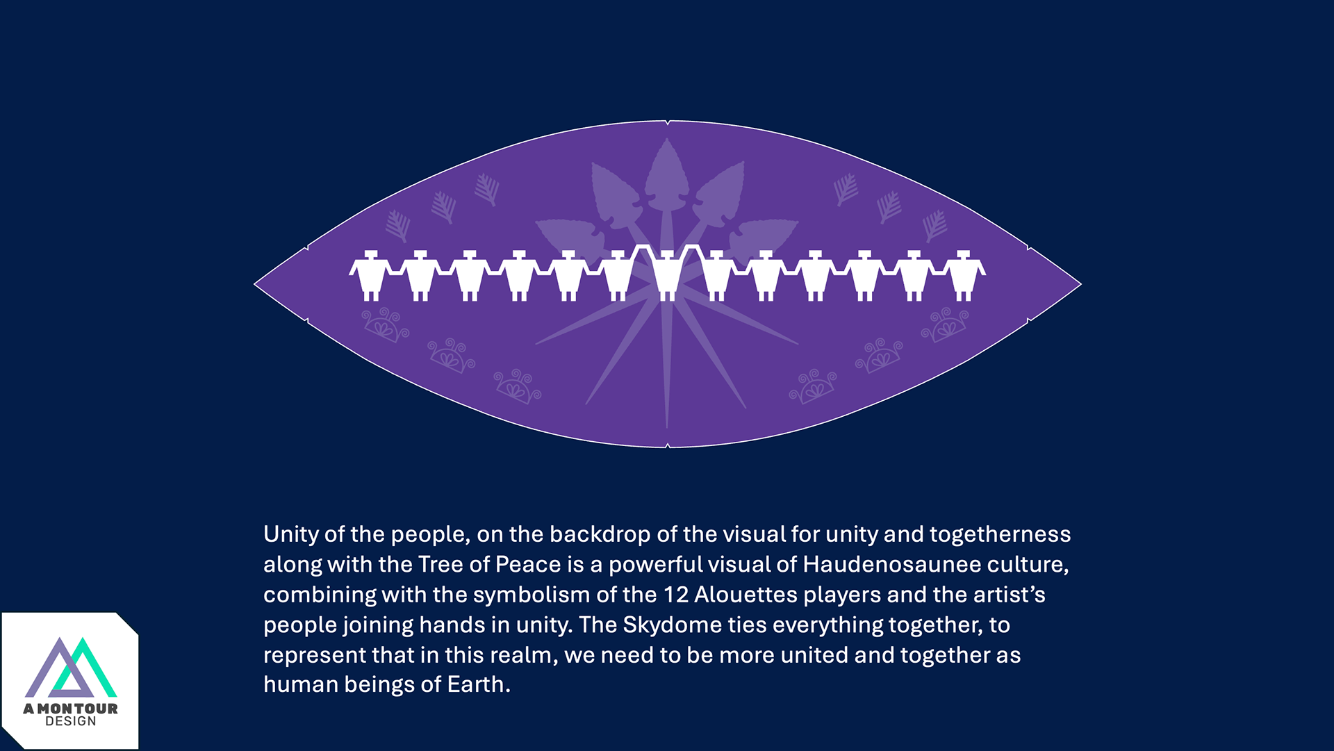
For Truth and Reconciliation Day, it is essential to represent all Indigenous people in the province of Quebec. This is why I chose to turn the logo into a dream catcher as an overarching theme. The red wraps around the bird are the leather a dream catcher base is wrapped in.
The Kanien'kehá:ka (Mohawk People) are the custodians of the land now called Montreal, traditionally called Tiohtià:ke - hence TIOHTIÀ:KE ALOUETTES. The two languages represent the collaboration of this project.
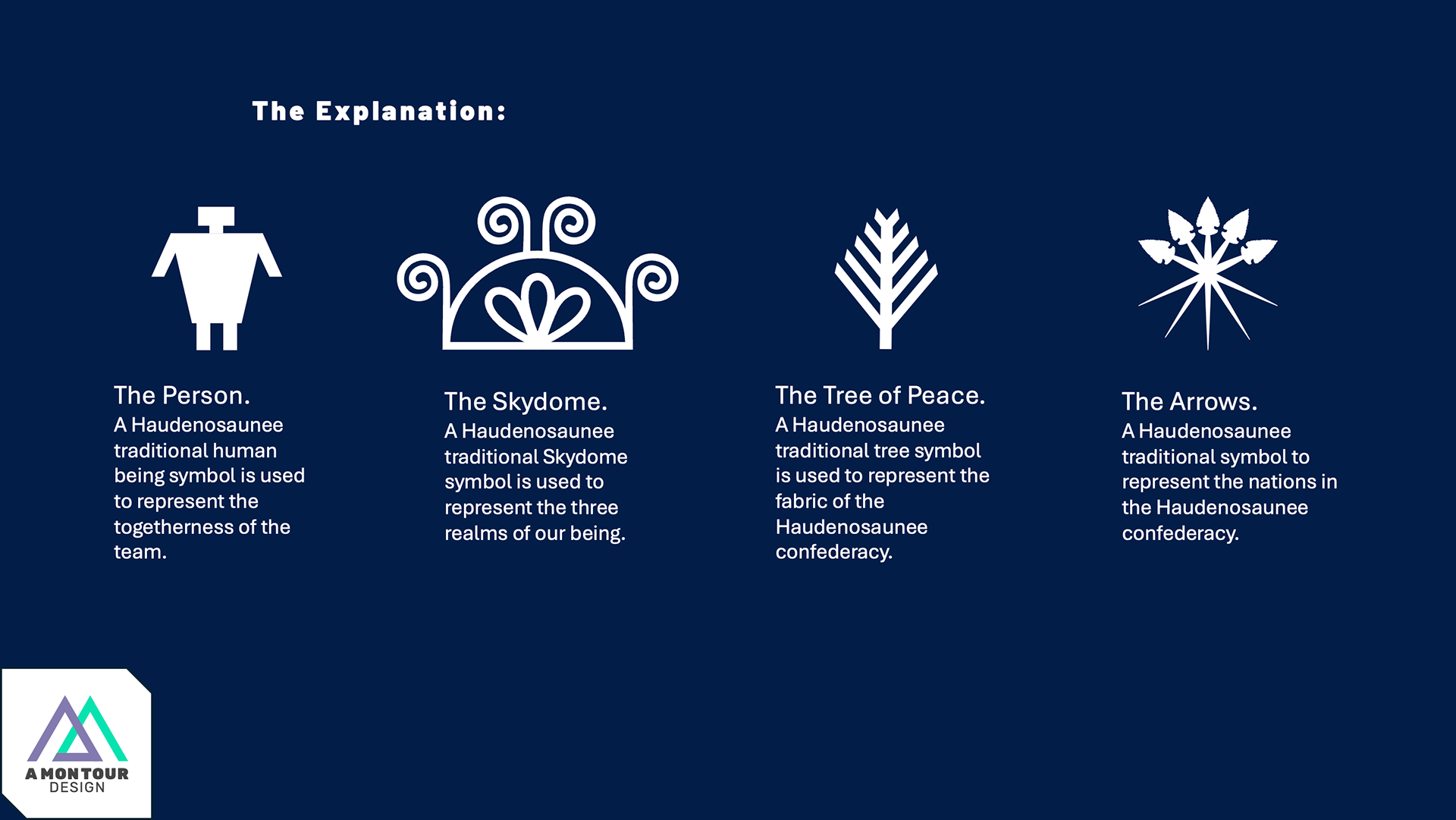
The three feathers represent the Kanien'kehá:ka. Our traditional headdress is called a Gustoweh, and the Mohawks wear three feathers in ours.
The dream catcher webbing showcases star-style shapes, each with 12 points, representing the 12 men on the field at a time in the CFL.
The Alouettes' colours and font were kept for a second representation of the collaboration of this project.

Finn With Game Helmet. Back View.

Finn With Game Helmet. Side View.
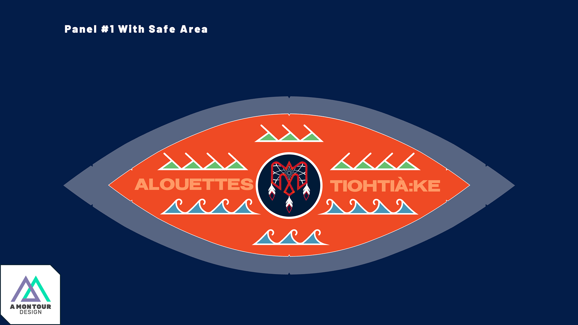
2025
The Montreal Alouettes contacted me to add to the project for this upcoming season. This year, Montreal has a home game during the CFL's Truth and Reconciliation weekend, and they wanted to do something special—a custom football.